Gaye Donaldson
In 2012, therapist Gaye Donaldson contacted me to create a new look for her website. What she wanted was something that felt alive yet something that reflected the calming nature of her work. After sitting down with her and getting to understand her style of work, we settled on a moving stream of colour. This would flow over a selection of stones in the background (She uses these stones in her work to identify patterns within problems). The stones would also glow in random patterns to highlight structure within chaos, a key message in her therapy.
As blogging was going to be an important element of her SEO, I chose WordPress and developed a completely custom theme. I incorporated a new Eventbrite booking system for managing her sessions. We also chose MailChimp for her campaigns. I made sure that her site was completely SEO friendly and out of thousands of sites relating to her line of work, she’s currently on page 1 on Google. As with all my websites, the site is also fluid and mobile optimised.
The remit for her logo was that it needed to embody the company name and the ethos of her business. This was to help others overcome obstacles in their lives and turn a corner in their lives. I decided I was going to go for a typographic logo and concentrate on her initials, but I wanted it to be one shape: a symbol. I settled on the design above as it took the idea of turning someone’s life around from being on a downward path to rising back up again. It also contains both the ‘G’ and the ‘D’ of her initials.
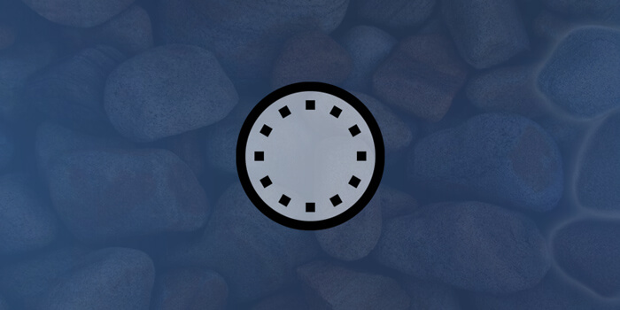
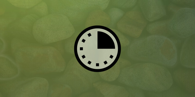
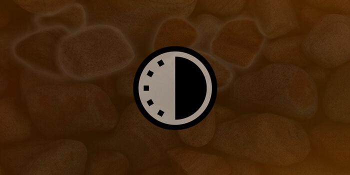
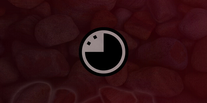
Below are the different colours that the site takes on at varying times of the day. Gaye Donaldson chose these to reflect the ambience of the hour.
